Thursday, November 18, 2010
Why I choose Java Jazz Festival?
Wednesday, November 17, 2010
assignment 1 : e-wallpaper
from the previous post. I've said about my first assignment is to make a wallpaper with the theme of the festival. I choose java jazz festival as my wallpaper theme.
I'm thinking to make a unique wallpaper so I choose a black background for the base of my background. here, I begin to share my artwork.
--------------------------- assignment 1
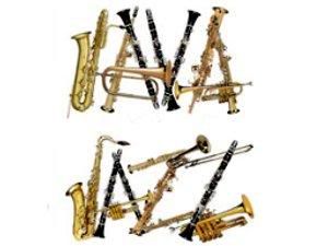
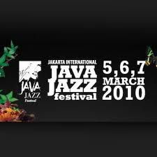
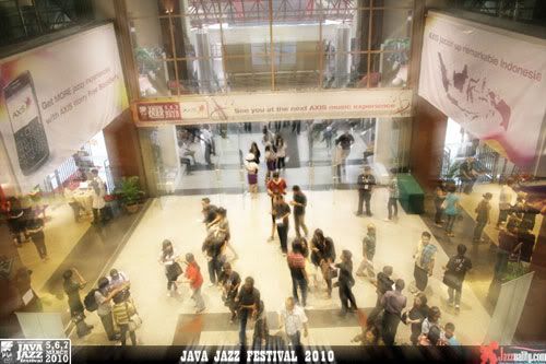
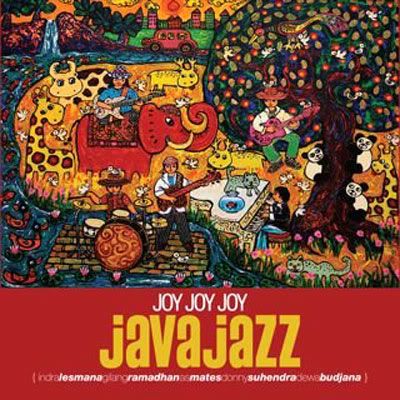
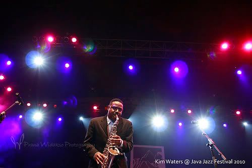
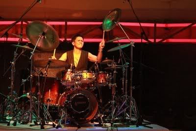
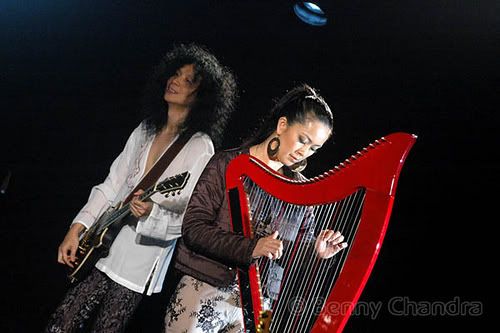
I've search some pictures from Google and Deviantart that related with my theme, and I collect these pictures :
at first you can fix the pictures with control the images brightness and contrast, I also make it balance so all of the pictures have the same colour mode and then, I begin to work with my pictures.
PART 1 : PLAY WITH THE PICTURES
this session I named, play with the pictures. It's so easy, you just have to fix your picture first, and don't forget to make your new artwork layer, and I chose black as my base background.
after make the base background, open the pictures, select > all, edit > copy
back to your base background, edit > paste, resize your image with edit > free transform and place it nicely
do the same thing with other pictures, and then place it nicely. Arrange the pictures so it blends together and look nice, use your creativity to arrange them. If it looks strange, use erase tool to erase the certain part so the pictures will look nice.
this is the final looks after I arrange all the pictures.
Wednesday, November 3, 2010
wallpaper ideation
so I chose JAVA JAZZ FESTIVAL for my wallpaper design.
What is Java Jazz Festival ?
Java Jazz Festival (JJF) is one of the largest jazz festivals in the world Jakarta, Indonesia. An annual jazz festival held every early March it was designed to be one of the largest jazz festivals globally. It was held for the first time, in 2005, approximately 125 groups and 1,405 artists performed in 146 shows. The festival was attended by 57,800 visitors, during its three-day stretch.
Up until the fourth Festival in 2008, there were 180 Indonesian and international groups, and 1,600 artists that performed in 300 shows on the festivals 18 stages. The festival in 2008 was attended by 69,000
JJF’s motto, “Bringing the World to Indonesia”, is implemented through the act of inviting numerous international artists to the festival. This is not only intended to treat the public with a feast of international talents, but also as an opportunity for international artists to see the talent of Indonesia’s jazz musicians, as well as jazz improvisations paired with Indonesian traditional music and also arouse collaborations on JJF's stages.
During the four years of the festival, collaborations create a new musical harmony. People of diverse background (nation and culture) meet in harmony through jazz.
Peter F. Gontha, the director claims that musicians are the appropriate ambassadors to vocalize peace.
Jakarta International Java Jazz Festival showcases jazz, and other genres, including the ‘jazz ‘n beyond’ form presented by DJs. As a result, JJF's performance areas are always packed with audience from a wide range of age groups. It is a fact that most foreign musicians were awed that JJF also attracts teenage viewers.
source : wikipedia.org
why I chose Java Jazz Festival ?
Because I love music a lot especially Jazz music. The mellow and chic feeling makes me comfortable. Java Jazz Festival always be the one of a lot of music festival that makes people one to come again, because of a lot of musician will come to this festival and also nice performances. It always held in Jakarta.
Wednesday, October 27, 2010
about adobe photoshop
Adobe's 2003 "Creative Suite" rebranding led to Adobe Photoshop 8's renaming to Adobe Photoshop CS. Thus, Adobe Photoshop CS5 is the12th major release of Adobe Photoshop. The CS rebranding also resulted in Adobe offering numerous software packages containing multiple Adobe programs for a reduced price. There are two versions of Photoshop: Basic and Extended, with Extended having extra features available. Adobe Photoshop Extended is included in all of Adobe's Creative Suite offerings except Design Standard, which has the Basic version. - wikipedia
THE TOOLS :

Rectangular Marquee Tool (M)
Use this tool to make selections on your image, in a rectangular shape. This changes the area of your image that is affected by other tools or actions to be within the defined shape. Holding the [Shift] key while dragging your selection, restricts the shape to a perfect square. Holding the [Alt] key while dragging sets the center of the rectangle to where your cursor started.

Move Tool (V)
Use this tool to, well, move things. Usually you use it to move a Layer around after it has been placed. Hold the [Shift] key to limit the movements to vertical/horizontal.

Polygon Lasso Tool (L)
Ok, this should be the Lasso Tool, but I use the Polygon Lasso a lot more often. Use this to draw selections in whatever shape you would like. To close the selection, either click on the beginning point (you’ll see the cursor change when you’re on it), or just double-click. When holding the [Ctrl] key, you’ll see the cursor change, and the next time you click, it will close your selection.

Magic Wand Tool (W)
Use this to select a color range. It will select the block of color, or transparency, based on wherever you click. In the Options Bar at the top, you can change the Tolerance to make your selections more/less precise.

Crop Tool (C)
The Crop Tool works similarly to the Rectangular Marquee tool (see above if you have no short-term memory). The difference is when you press the [Enter/Return] key, it crops your image to the size of the box. Any information that was on the outside of the box is now gone. Not permanently, you can still undo.

Slice Tool (K)
This is used mostly for building websites, or splitting up one image into smaller ones when saving out. It’s kind of an advanced tool, and since you’re in here for the basics, we’ll kind of skip over it. Kinda makes you mad I made you read all that for nothing, huh?

Healing Brush Tool (J)
This is a really useful tool. Mildly advanced. You can use this tool to repair scratches and specs and stuff like that on images. It works like the Brush tool (see below). You choose your cursor size, then holding the [Alt] key, you select a nice/clean area of your image. Let go of the [Alt] key and paint over the bad area. It basically copies the info from the first area to the second, in the form of the Brush tool. Only, at the end, it averages the information, so it blends.

Brush Tool (B)
This is one of the first tools ever. It’s what Photoshop is based off of. Well, not really, but it’s pretty basic. It paints one your image, in whatever color you have selected, and whatever size you have selected. There’s a lot of options for it, but this is basic, so you don’t get to learn them. Ha.

Clone Stamp Tool (S)
This is very similar to the Healing Brush Tool (see above). You use it the exact same way, except this tool doesn’t blend at the end. It’s a direct copy of the information from the first selected area to the second. When you learn to use both of these tools together in perfect harmony, you will be a Photoshop MASTA! Not really, it’s just less irritating.

History Brush Tool (H)
This tool works just like the Brush Tool (see above) except the information that it paints with is from the original state of your image. If you go Window>History, you can see the History Palette. The History Brush tool paints with the information from whatever History state is selected.

Eraser Tool (E)
This is the anti-Brush tool. It works like an eraser (duh) and erases whatever information wherever you click and drag it. If you’re on a Layer, it will erase the information transparent. If you are on the background layer, it erases with whatever secondary color you have selected.

Gradient Tool (G)
You can use this to make a gradiation of colors. Gradiation doesn’t appear to be a word, but it makes sense anyway. It creates a blending of your foreground color and background color when you click and drag it. Like a gradient.

Blur Tool (R)
The Blur tool is cool. It makes things blurry. Click and drag to make things blurry. The more you click and drag, the blurrier things get.

Dodge Tool (O)
This tool isn’t as crappy as the car brand. It’s actually used to lighten whatever area you use it on. As long as it is not absolute black. Absolute black won’t lighten.

Path Selection Tool (A)
You use this tool when working with paths. Since this is all about the basics, I won’t go into details. It’s related to the Pen Tool (see below) though.

Horizontal Type Tool (T)
It makes type. Or text. Or whatever you want to call it. You can click a single point, and start typing right away. Or you can click and drag to make a bounding box of where your text/type goes. There’s a lot of options for the Type Tool. Just play around, it’s fairly straight-forward.

Pen Tool (P)
I mentioned this tool above. It’s for creating paths, in which you would use the Path Selection Tool to select the path. Paths can be used in a few different ways, mostly to create clipping paths, or to create selections. You use the tool by clicking to add a point. If you click and drag, it will change the shape of your path, allowing you to bend and shape the path for accurate selections and such.

Rectangle Tool (U)
By default it draws a Shape Layer in the form of a rectangle. It fills the rectangle with whatever foreground color you have selected. It’s pretty complicated, don’t hurt yourself with this one.

Notes Tool (N)
Like post-it notes, but digital. You can use this tool to add small little note boxes to your image. These are useful if you’re very forgetful or if you’re sharing your Photoshop file with someone else. I’m pretty sure it only works with .PSD files.

Eyedropper Tool (I)
This tool works by changing your foreground color to whatever color you click on. Holding the [Alt] key will change your background color.

Hand Tool (T)
You can really make short work of your job with the Hand Tool. It’s for moving your entire image within a window. So if you’re zoomed in and your image area is larger than the window, you can use the Hand Tool to navigate around your image. Just click and drag. You can get to this tool at any time when using any other tool by pressing and holding the [Spacebar].

Zoom Tool (Z)
Pretty obvious what this tool does. It allows you to zoom into your image. Don’t be dumb, it doesn’t actually change the size of your image. Hold the [Alt] key to zoom out. Holding the [Shift] key will zoom all of the windows you have open at the same time. Double-click on the Zoom Tool in the palette to go back to 100% view.


